Wassily Kandinsky (1866-1944) is our artist of the moment. An abstract art expert, his paintings are expressionist, vibrant, and timeless.
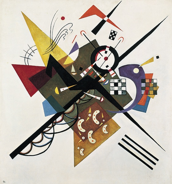
We recently came across the above piece from 1923—On White II.
Why does it appeal? We love how clinical it is, but with enough flourishes to keep you looking for more. It’s uplifting! Joyous. And this only made us want to find out more about Kandinsky’s canon.
Kandinsky’s Rise to Abstract Angles
Kandinsky was a Russian artist and theorist. He studied at Moscow University in economics and law. After developing his career, he moved to Munich, before eventually settling in France in 1939. He became a citizen there until his death.
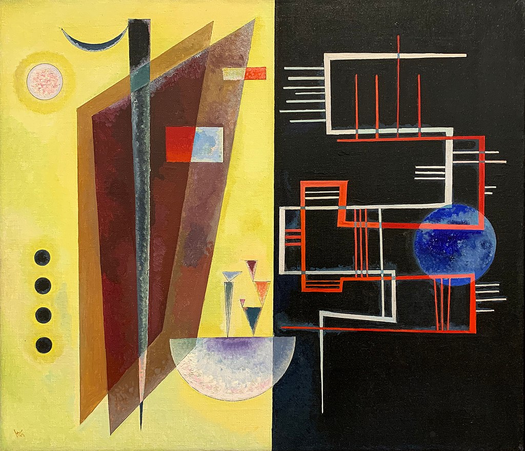
As with many creative geniuses, there was something special about him. We’ll reveal what shortly. But first, here’s another of his works.

For most of us looking at his art, we see the colours, shapes, and get a general sense for themes. What is it, the planets? Atoms? Abstract disorder?
Well, he was certainly big on abstract. He wanted his work to be a philosophical expression of his being. Music played an enormous part in his creative process.

Kandinsky had a perceptual condition called synesthesia (or synaesthesia if you’re English). It’s where one sense works simultaneously with another—sometimes more than one.
For the artist, when he saw colour he heard sounds. If he heard sounds, he’d see colours. A bright yellow brought about trumpeting trumpets—there is a certain freeform jazzy feel to the above pieces, eh?
His various concepts are an interpretation of those distorted sights and sounds.
For example, his 1911 work Impression III (Konzert) is notable for its use of yellow—it was his visual representation of a concert he’d attended by his friend. The composer Arnold Schoenberg.
And here’s the man going for it with an impromtu piece. Fabulous, huh?
The fantastic news for us modern folks is he was prolific, painting 159 oil paintings and 300 water colour pieces between 1926 and 1933 alone.
And so researching his work and art theory, we’ll be delving deeper into his world to find out more of his perspectives on art, life, and the power of straight lines.
Kandinsky’s as an Artistic Theorist
His first theory was published in 1910: Concerning the Spiritual in Art.
In it he dwells on how colours affect the painter’s palette through the effect on the eye and its psychological impact.
Kandinsky felt artistic experiences are about feeling. Different colours affect our mood.
He studied further into psychology forms and later published Point and Line to Plane in 1926—he was interested in the forces on straight lines and curvature.
Now, we work in marketing and there’s a great deal of focus on this in, for example, web design.
Kandinsky’s notions on colour and psychology pay a heavy part in every single advert we see around us.
A yellow could disturb or attract, given the right setting. Red is angry! Blue is a relaxant, which is why it’s often used across financial services sites.
The difference here is 99.9% of marketing is obnoxious corporate nonsense. Kandinsky was a creative genius—let us enjoy his work forever more!

This is fabulous! I love abstract art first off, I also had a friend who was an synthesis. It is quite mysterious. He often wrote poetry to music and could (so he said) feel the sounds and color of the music. Indeed a mystery. Love the post!
LikeLiked by 1 person
Thank you for stumbling across my blog, we don’t get many folks around these parts. But, yes, you’re quite right about synthesis. I know no one like that. Although I did once make a lunch of beans on toast so spectacular it could have won Tate Modern.
LikeLiked by 1 person
That more up my street. Baked bean sandwiches, yummy! Need a good beer with that. Oh, yes, the synthesis. I really do love that artwork, it’s sensational.
LikeLiked by 1 person
That should totally be a thing. I think they did a baked beans on toast Pot Noodle a while book. I’d buy that for a dollar.
LikeLiked by 1 person
A book on Pot Noodles and baked beans. I must have that in my library.
LikeLike
Do you have Pot Noodles in ‘Murricah? *Mansplain mode* It’s instant noodles. In a pot.
LikeLiked by 1 person
I’m sorry , I only speak Murricah English, Pot Noodles are little sticky dough things filled with meat or vegetables and sometimes they are call pot stickers, actually they are Japanese cuisine. We are a classy bunch here. I need more mansplaining obviously.
LikeLike
Incorrect. Pot Noodles are like those things you find attached to cement mixers.
LikeLiked by 1 person
Oh, we really are in two different worlds, lol! Cheers!
LikeLike
u wot m8?
LikeLiked by 1 person
I had a professor at the University of Essex, who was really into all this stuff. His name was Peter Vergo, I think he wrote a book on it. All very interesting stuff.
LikeLiked by 1 person
I’m an English student, so only started catching up on the art world in recent years. I’ll check out your professor’s book, thank you!
LikeLike